

E-commerce Architecture & WPO
Performance Engineering (WPO) for WooCommerce. We optimize database and server to achieve loads under 1 second. If your store is slow, your competition wins.
[toc_placeholder_mobile]
Our brain is an energy-saving machine. To make thousands of decisions a day, it uses mental shortcuts based on experience. In the visual world, its main shortcut is color. It is the first data it processes and the one it uses to make an instant judgment about whether something is reliable, expensive, natural or urgent.
This post will teach you how to use those shortcuts to your advantage. Together we will decode why certain colors already “belong” to your professional sector and how a simple palette change can transform the perception of the same product. It’s time to talk to your client in the language that his brain understands first.
The value of a product lies not only in its quality, but in the story that its presentation tells. Design, color and photography are capable of transforming a functional article into a premium experience.
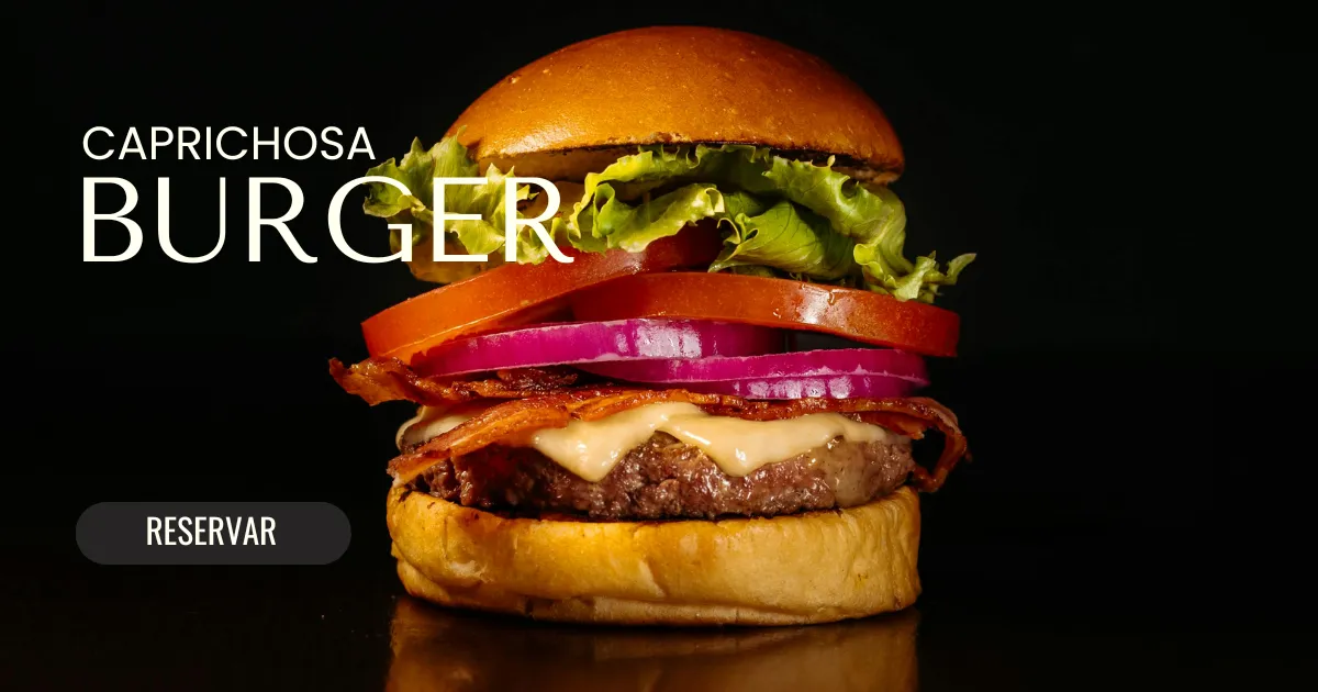
The environment not only decorates, but actively builds the perception of quality and the value that the customer is willing to pay.
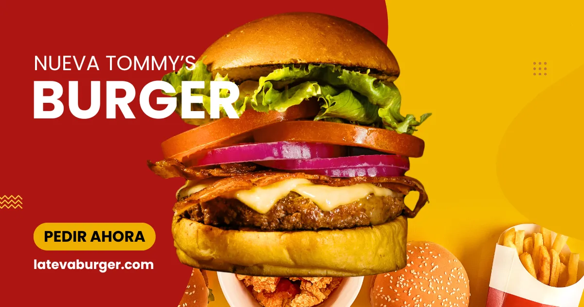
The choice of colors for your website should not be random. They are mental shortcuts for the client to instantly identify your sector.
Not all sectors have defined colors that represent them; some admit more flexible palettes. Innovating within these palettes creates unique identity and consistency with your audience’s expectations.
If you wonder how to adapt the perfect palette to your sector and improve the perception of your products, tell us your case in the comments. We will help you choose colors that speak directly to your customer’s brain.
Color not only attracts attention; it defines the value that your product communicates at a glance.

No hay comentarios todavía. ¡Sé el primero en comentar!


